Myfitnesspal
Driving measurable growth across shifting business priorities and strategic initiatives while strengthening and evolving the Premium brand identity.
24%
5%
lift in incremental subscriptions
$5.2M
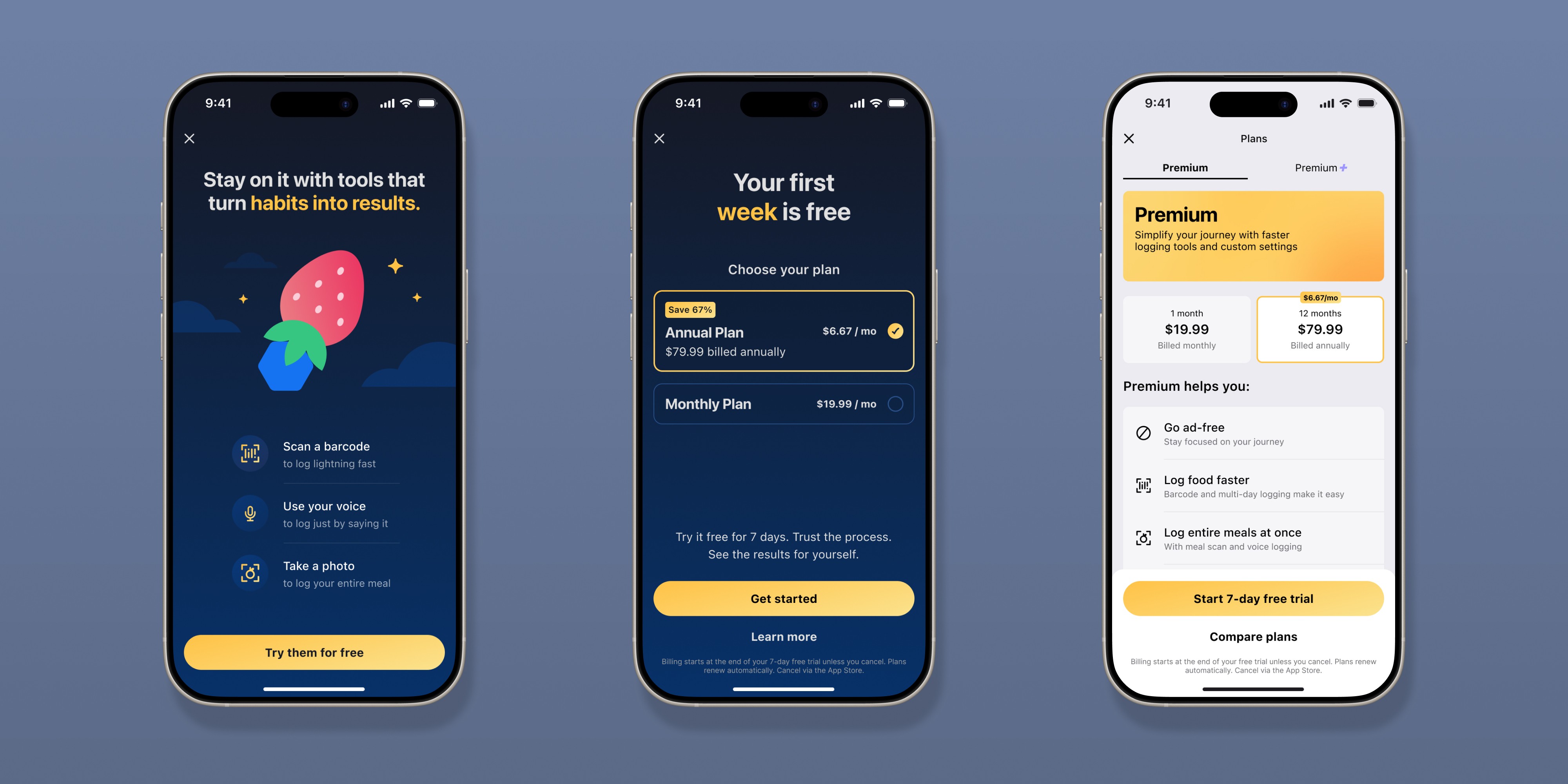
Our goal was to reimagine the Premium subscription experience through a focused blend of brand, UX, and growth strategy — improving value communication, simplifying subscription decisions, and driving significant increases in conversion and annual plan adoption across iOS and Android.
My Role
Led the redesign of our Premium brand and subscription paywall experience across strategy, UX/UI, illustration, motion, and design systems, partnering closely with our cross-funtional team from concept through launch.
The background
Quick upsell history
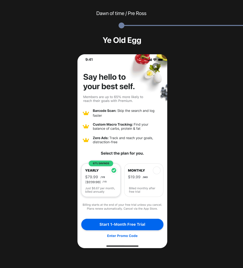
When I joined the team, our subscription flow relied on a legacy upsell known as the "Egg" paywall. While it drove strong trial starts, conversion to paid subscriptions remained relatively low, suggesting the experience was optimized more for acquisition than long-term value.
As we introduced a new Premium tier with meal planning, we needed a more scalable upsell system capable of supporting multiple products and value propositions. This became an opportunity to rethink the Premium experience from the ground up.
I led the design of the Premium Hub, resulting in a 7% lift in R→T conversion while creating a flexible foundation for future monetization efforts.
That work ultimately led to Primer + Spoke, our latest evolution of the Premium experience and the focus of this case study.


The Challenge
Beyond the Hub
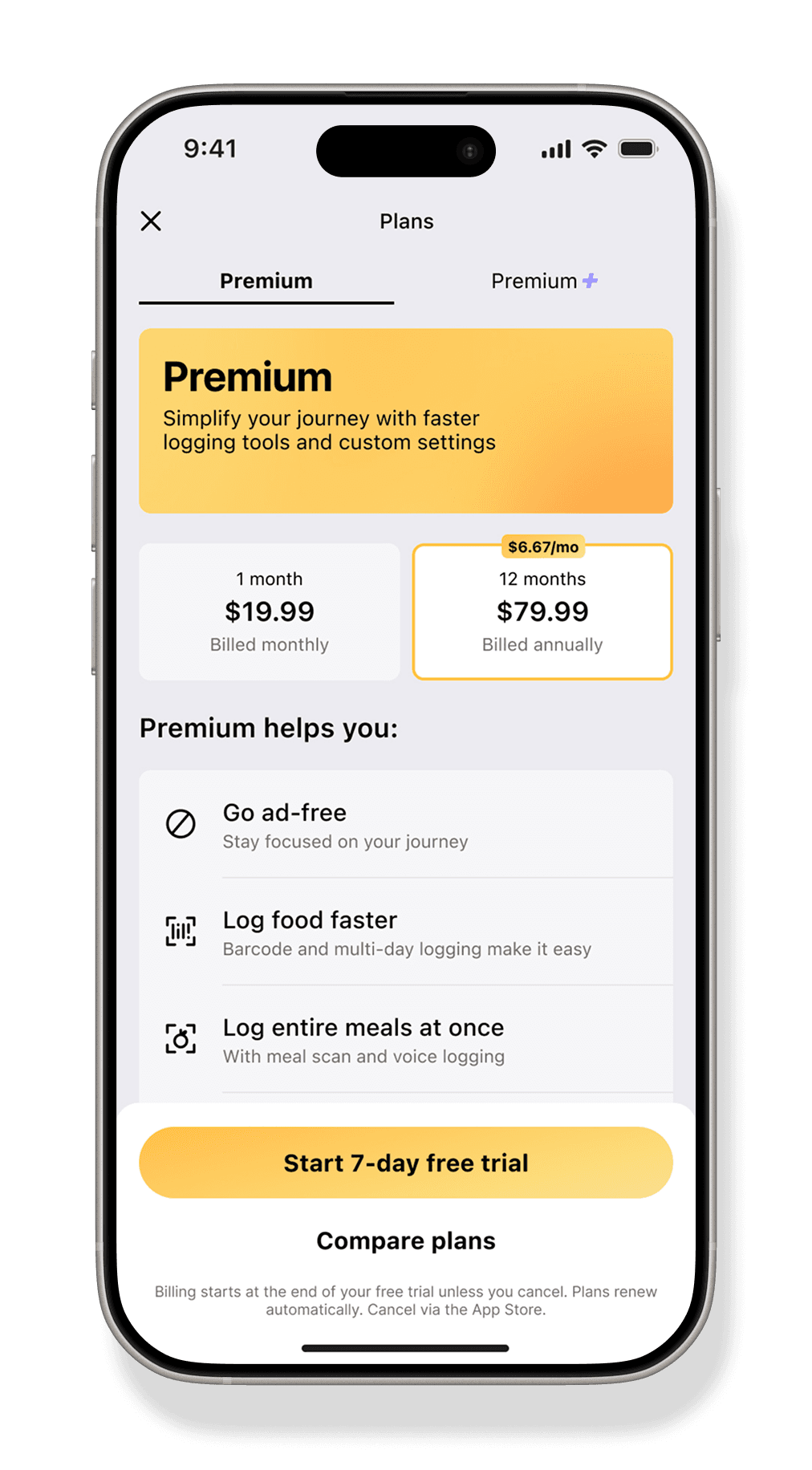
Designed in 2024 as part of a broader tiering initiative, the existing 'Premium Hub' improved conversion and established the foundation of our premium design system. However… its dense, feature-heavy experience made it difficult for users to quickly understand the core value of Premium.
What wasn't working:
Users were asked to process feature education and pricing simultaneously
Core Premium benefits were buried within dense content
The experience felt functional, but not aspirational
Conversion opportunities were being lost due to overwhelm and friction
The Journey
Focused Excitment
Our team focused on progressive disclosure and reducing cognitive load throughout the conversion journey. Guided by years of user research, we hypothesized that separating value education from pricing decisions would create a clearer, more effective subscription experience — drawing inspiration from focused multi-step upsell patterns used by industry leaders.
Simplifying information architecture
Prioritizing clarity over feature density
Focusing on digestible decision points
Elevating emotion through movement and visual storytelling

Firt Attempt
Big Fail
Our first attempt at a multi-screen upsell used three primer screens and required users to complete the entire flow before reaching the paywall. By removing opportunities to exit, we increased friction and saw performance suffer. It was a humbling but important lesson that challenged our assumptions and reinforced the importance of balancing education with user control.

The Solution
Multi Screen Upsell
A major breakthrough was restructuring the experience into a two-step “Primer + Spoke” model. However, we initially tested a 4 screen model that included 3 primers before the user actually got to the payment screen (aka spoke). This was our first iteration, and altho we knew we had executed our plan, the results were shockingly bad.. a -9% decrease in trails starts vs control.
Primer
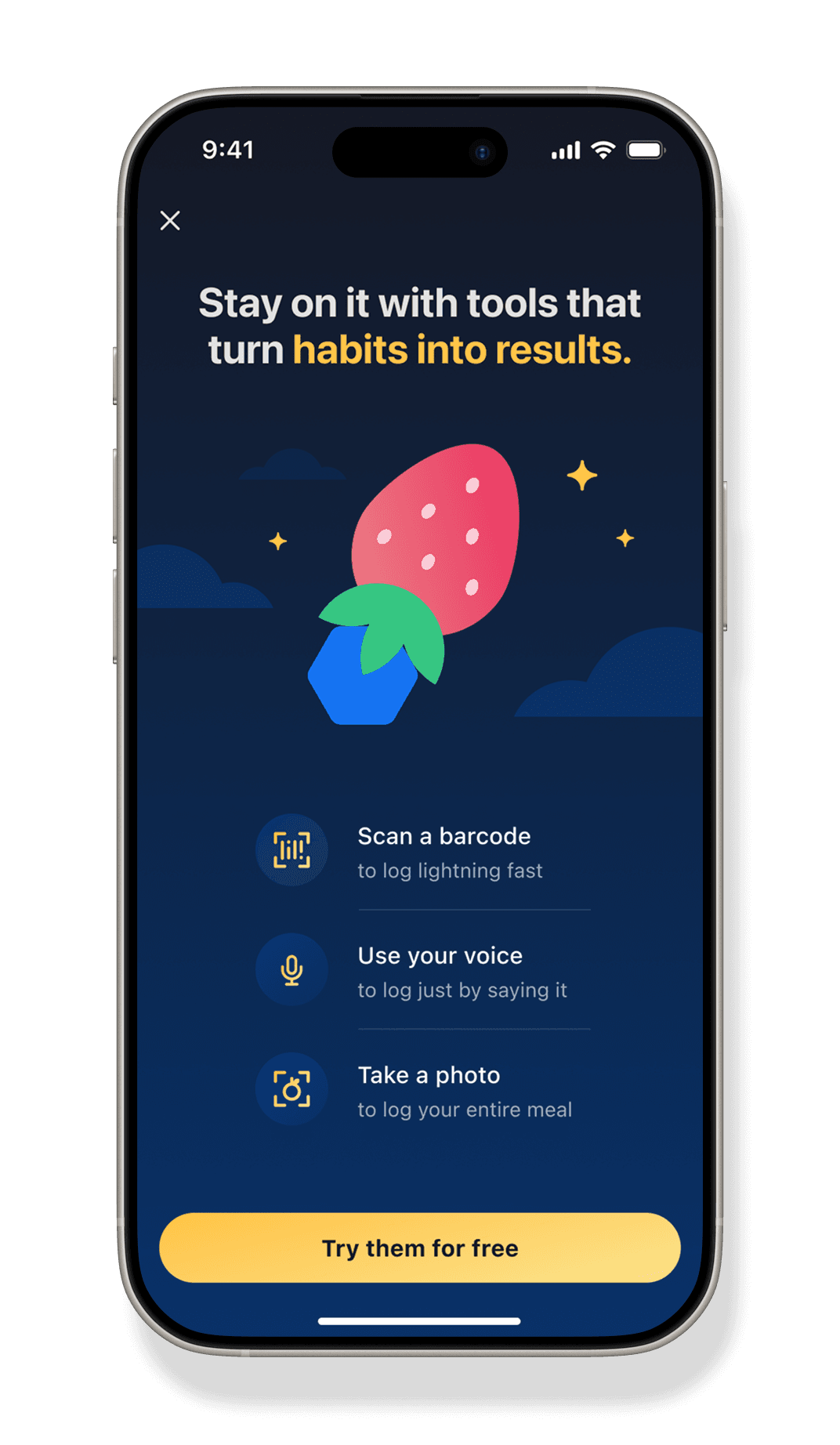
The first screen focused entirely on communicating the value of Premium in a concise, emotionally engaging way. This allowed users to understand the offering before encountering pricing.
What Worked
The "rocket strawberry" scene creates visual delight with illustration & motion
Simplified list of core logging features
Headline sets the tone for the overall message
CTA reinforces the free trial
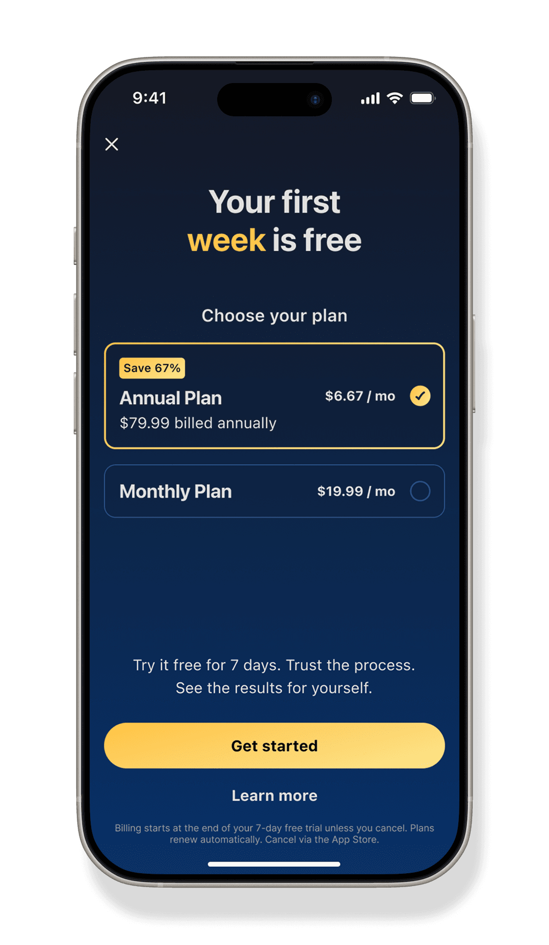
Spoke
What worked
Clear trial focused headline
Both plans are framed in equivalent monthly value terms
Savings on the annual plan became immediately understandable
Yearly plan is pre-selected creating a clear visual hierarchy
Outcome
Visual Storytelling Matters
The redesign drove significant increases in trial starts, subscription conversion, and annual plan adoption across iOS and Android. Following the initial launch, the new “Primer + Spoke” framework was expanded across additional entry points throughout the app, where strong performance gains continued.
The project demonstrated how thoughtful UX strategy, progressive disclosure, visual storytelling and elevated brand expression could directly influence both user behavior and business outcomes.
5%
lift in incremental subscriptions
$5.2M
increase in
annualized sales